Since my last draft I have averted back to the plan that I created and I have used this piece to create this first draft.
The two pictures that I have added have both been edited and are now complete.
Original picture for artist:
 1st edit:
 in this is used the quick selection tool on Adobe Photoshop to remove the unwanted background. I have had trouble with the editing around the microphone head as the colour of it is very similar to the ceiling colour, due to this the software has had trouble differentiating the two separate items.
2nd edit: during this editing process I had to manually remove the background around the head of the microphone using different brushes on the software. After this I hardened the outline of the character in the picture to make him stand out.
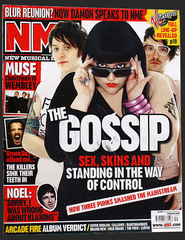
Final edit: after the previous edit I felt that the picture was ready to have an effect added to it. I chose to use this type of effect because I felt that it made the character in the picture seem as if they are steeping out of the page, this effect was enhanced when I added a spotlight onto the image using the photo editing software, this gave another dimension to the subject and along with the shadows in the picture it added to the aim to make it come out of the page. The spotlight on the person also adds to the mise en scene, where the music artist is on a stage and a spotlight is on him. The pose the character is doing ties in well with the layout of my magazine and using his arm position I decided to put it bellow the masthead for the page "Inside this month" so that he is pointing and this will direct the audiences attention to it.
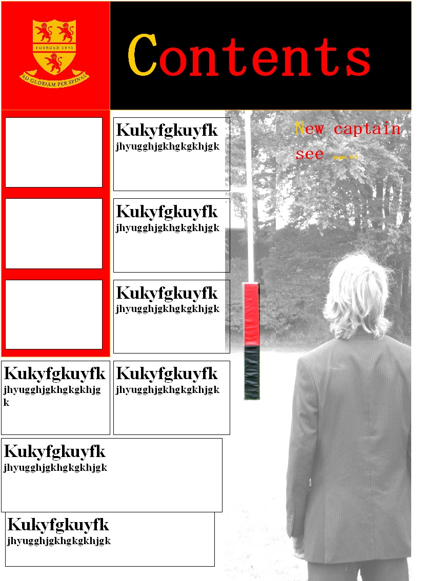
Original picture: when taking this picture I took it so that it will be used in the middle page spread ( which it will be ) but I feel that it will also fit into my contents page after some editing.
Final edit: For the contents page I have decided to take a less conventional approach to the layout, in particular th focus on the main story ( in this case about Route - A ) I decided to place his picture to the right edge of the page and, when editing it I made sure that the contrast of the picture was manipulated so that he would fade into the page and only his white t-shirt and and face would stand out, this was done because I felt that the front cover in relation to pictures was solely devoted to the main topic not including any visual aids for the other stories, so for the contents page they received more attention compared to the main story. The use of white, red and blue in this photo allow the picture to still stand out and draw the reader, but it does not impose on the other stories.